


Creative Direction Notes re: Higher
Notes from a recent design sprint (taken from my warpcast)

martin really articulated this process well on his recent appearance on liquid culture
new design choice → new mindshare territory → new aspects of the larger public domain brand that is higher
i've done a few design sprints now:
↑ first one at the start of higher ~ 36 pieces
↑ second one during the mania phase for hmart
↑ third one was 100+ pieces using the hat, laser eyes, etc
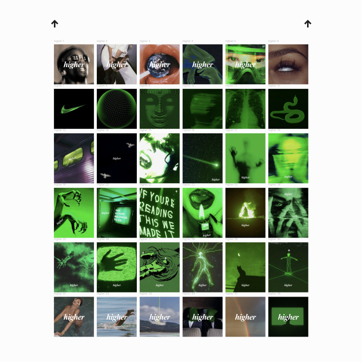
↑ fourth one here is 36 pieces exploring the green and times new roman
as a group we've explored arrow centric, nike, off-white, supreme, sport centric, meme overlay centric, and most recently greenifying everything this last sprint
i feel v good about the following:
↑ times new roman is a good alternative to helvetica (former lowercase latter uppercase imo)
↑ turning things green or using green things i believe has the most flexibility of creative direction at present
↑ times new roman lowercase higher also makes me much more confident in eventual brand partnerships. it has a really classy but non pretentious feeling to it imo
↑ a 'nishu tool' that puts every single well received tool into use on a really smooth front end (and app itself) is a priority imo
areas i feel are under explored that should be next in the queue:
↑ professional hot girls / fashion models / vogue & prada aesthetic
↑ motion photography (done a little but full effort still needed imo)
↑ greenifying anime and cartoons
↑ cinematic contextualizing of higher (feeling > visual identifier)
↑ normie core contextualizing of higher (feeling > visual identifier)
we are making great progress in 8mo as a collective but we have many more doors to open
the green has done a great job opening up space to identify w the feeling of higher over having to slap and arrow or the wordmark on it but we are still not developed in associating higher w a feeling on it's own.
tons of opportunity there imo